Exercise I
Due on Friday, October 16, 2020 before class

Problem Statement
Now, you have learned many different charts and plots and you have Tableau,
D3.js, R or other software tools available.
It is the time to do a simple exercise
and present your work in class.
Michigan Tech has been maintaining a snowfall records
here.
Snowfall is measured near Houghton County Memorial Airport by Michigan Tech's
Keweenaw Research Center.
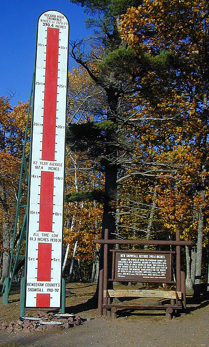
In the northernmost portion of the Keweenaw Peninsula, Keweenaw County Road Commission
measures the snow near Delaware, where snowfall amounts are typically greater than those recorded in Houghton County.
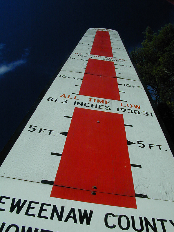
The following image shows you the snow depth indicator,
which is maintained by the Keweenaw County Road Commission mentioned earlier:


I have prepared an Excel file of Houghton county snowfall records from 1890 to 2020.
The data entries are taken from Michigan Tech's web site.
Click here to retrieve this file.
Use whatever techniques to help visualize this snowfall records dataset.
You may use many different charts/plots to illustrate your findings
and tell the audience your story as vivid as possible.
Always remember these:
find the trends,
hierarchical structures,
outliers if any,
similarity, etc.
in the dataset help people visualize your fndings in a convincing way.
My Expectations
Do your work as mentioned above.
If time permits, each of you may have to present your work in class.
Your presentation should be a 10-minute presentation plus a 5-minute Q&A in class
using PowerPoint or its equivalent.
The presentation order would be random.
After your presentation you should e-mail me a PDF file of your presentation slides.
Please follow the guidelines discussed in class to design your visuals
and present your work.
Always follow the Visualization Workflow
and select good visuals to present your story.
In particular, I expect your work includes, but is not limited to, the following items:
- What is your work flow?
- What do you want to know
(i.e., questions) from this dataset?
- What visualization techniques do you use?
- Use the terminology discussed in this class
to write your report. If you don't, you may receive a low to very low grade.
- Discuss data abstraction and task abstraction
of your work. In particular, what the abstraction of the dataset is?
What tasks have you performed? Again, use the terminology discussed in this class.
- If you used any informnation from our slides,
the assigned reading, and from elsewhere, make sure you cite each use properly.
You may choose a system you are familiar with, but make sure it is easily understandable
by me.
- Ensure that your report has to be
concise and to the point. This means that a long report and/or many visuals
may not translate to a high grade.
Only the content you present counts!
- Use paragraphs, sections, etc. properly.
Submission
- Each one of you build a web page to present your work.
- Your submission should include this web page in HTML text file and all needed images.
Submit a tar.gz file
via email at shene@mtu.edu.
- Also prepare a set of slides in case you may be picked for presentation,
if time permits.
- Also send me the link to your work by e-mail before the due date and time.
Make sure you will set the permission
of each file used in your report properly.
If I cannot access to your report, I cannot grade your work and, as a result,
you get a zero.
In other word, if I may fail to generate your web page,
I have to access your own page via the submitted link.
- I will e-mail you my comments and your grade.
Grading
My grading policy is very simple. A few key points are listed below:
- The quality of your questions and their answers?
- Have you used the best possible visuals to tell the audience
your story?
- Note again that the number of visuals is not the issue.
Instead, the use of good and understandable visuals is the key.
- Make sure you will do a smooth presentation.
I will assign Excellent, Good, and Fair to your work.
Your grade will be sent to you by e-mail
with my comments.

